
Dark Mode vs Light Mode UX: Best Practices & Implementation
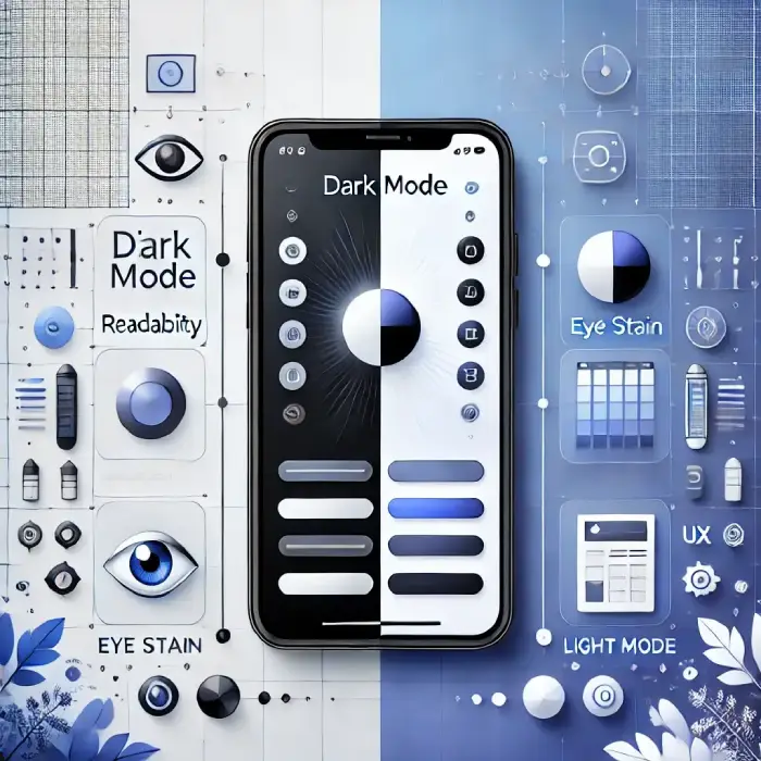
As a web developer, I’ve seen the Dark Mode vs Light Mode UX debate evolve from a simple “aesthetic choice” into a critical technical requirement. In 2026, users expect an interface that doesn’t just look good but adapts dynamically to their environment and device performance.
Whether you are building a high-speed portfolio or a content-heavy blog, the choice between these two modes impacts user retention, accessibility, and even battery longevity. Let’s break down the data-driven reality of modern UI design.
Understanding Visual Polarity
In UX design, interface themes are categorized based on optical polarity:
Dark text on a light background. Mimics classic print layouts and offers maximum legibility for fast document scanning.
Light text on a dark background. Reduces light emission, providing a comfortable view in low-light environments.
Mastering UI principles? Explore the Website Design Blueprint for Beginners and Top Web Design Trends for 2026.
Dark Mode vs Light Mode: 2026 Standards
| Feature | Light Mode | Dark Mode |
|---|---|---|
| Daylight Readability | Excellent | Poor (High Reflections) |
| Nighttime Comfort | Low | High |
| Battery Savings (OLED) | High Drain | 30% – 60% Savings |
| Reading Speed | Faster Scanning | Focused Reading |
| Eye Fatigue (Blue Light) | Higher | Lower |
Why Dark Mode is a Technical Necessity
1. The Psychology of Visual Fatigue
Users average 8+ hours of daily screen time. Dark themes decrease ambient brightness, protecting long-session users from excessive glare.
2. Hardware Optimization (The OLED Factor)
On OLED/AMOLED screens, pure black pixels turn off entirely. Utilizing dark interfaces can reduce mobile energy consumption by up to 60%.
3. High-End Aesthetic & Content Focus
Dark themes create visual depth, making UI elements and vibrant media pop without distracting background noise.
Why Light Mode Still Holds the Crown for Legibility
Watch Behind-The-Scenes Breakdowns
Subscribe to ByteScript MZA on YouTube for full-stack e-commerce tutorials.
2026 Best Practices for Web Developers
- Auto-Detection: Use CSS media queries like
prefers-color-schemeto sync with OS preferences. - Avoid Pure Black: Use rich dark grays like
#121212instead of#000000to prevent visual vibration. - Desaturate Accent Colors: Tweak saturated buttons/links so they don't produce harsh glare on dark backgrounds.
- Provide a User Toggle: Always give visitors explicit manual control over theme switching.
Hand-Picked Related Guides
- •Improve site layout flexibility with Modern CSS Layouts for Websites.
- •Ensure top performance while styling: Core Web Vitals in 2026.
Conclusion: Flexibility is the Key to UX
The Dark Mode vs Light Mode UX debate isn’t about choosing a single winner—it’s about providing context-aware flexibility.
Offering a high-contrast Light Mode for clarity alongside a sleek Dark Mode for low-light comfort ensures your site delivers an accessible, modern, and high-performing user experience.
Frequently Asked Questions
Clear answers to common questions about this topic.

Muhammad Zubair Abid
Full-Stack Developer & Founder of Gadget Crunchie. Expert in SEO, Web Performance, and Tech Reviews.